 Back to the site ↗
RIGHTTREAD / BRAND KIT 001
Made to move forward.
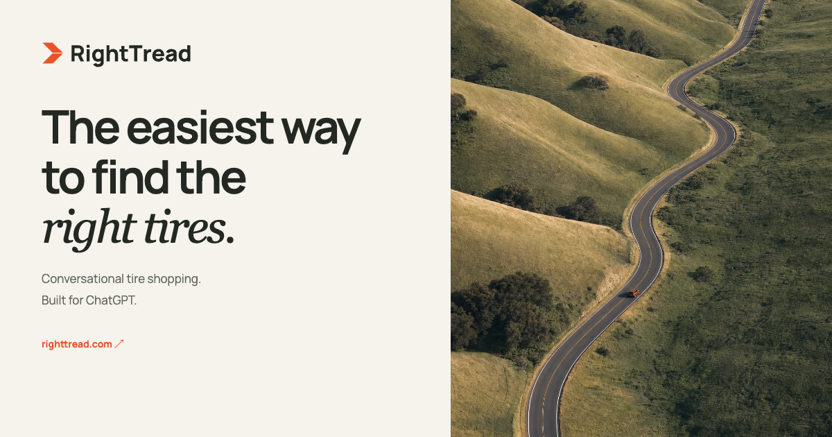
A confident, approachable identity for a clearer kind of tire shopping. An orange tread-inspired direction mark. Warm, open colors. A name that gets straight to the point.
Download the brand kit ↓The essentials.





A little warmth. A clear signal.
Asphalt
#242823
#242823
Warm ivory
#F5F3EC
#F5F3EC
Signal orange
#E9542A
#E9542A
Pale sage
#E7EADD
#E7EADD
The right words, too.
The easiest way to find the right tires.
Plainspoken. Helpful. Specific. We explain the trade-offs, skip the jargon, and never promise what we haven’t verified.
Typeface: Manrope for the wordmark, headlines, and UI. Georgia Italic for a human, editorial accent. Leave at least half a symbol’s width around the logo. Don’t stretch it, add effects, or use the orange mark on a low-contrast background.
AI-assisted original brand exploration, prepared for RightTread. Production SVGs are editable outlined artwork. Artwork generation does not establish trademark clearance.